ON THIS PAGE
By Efe Berke Colaker, Founder at GetleadReviewed by the Getlead editorial team for accuracy. Last updated August 2026.
Outbound dashboards usually count activity: emails sent, tasks completed, sequences active. None of it predicts anything, which is why the weekly review turns into a discussion about effort.
Six numbers explain outcomes and give warning before pipeline moves.
The six numbers
A leading indicator is a number that moves before the outcome does, which is what makes the third and fourth rows worth watching weekly rather than monthly.
For example, positive replies per thousand falling for two weeks while volume holds tells you something changed in placement or targeting, and it says so before the meeting count reflects it.
Why open rate comes off the dashboard
Open tracking fires when an image loads, and privacy features load images without a human involved.
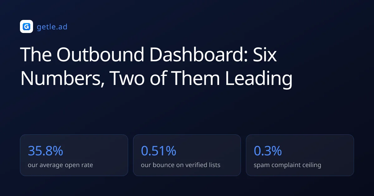
Across 34,973 tracked sends our average open rate was 35.8%, a number that moves with mailbox provider behaviour rather than with recipient interest. Optimising subject lines against it optimises for an artifact.
Keep it visible as a diagnostic if you like, since a sudden collapse can indicate a delivery problem. Never make it a target.
Everything per segment
An aggregate hides the segment carrying the damage and the segment carrying the results, which are rarely the same one.
- Report all six numbers per segment, not per campaign.
- Keep one segment per campaign so attribution is possible.
- Compare segments in the same week, since provider behaviour shifts over time.
- Retire a segment when positive replies stay near zero across two clean sends.
For example, three segments in one campaign returning 18 replies looks like a 0.9% rate. Split, and you often find one segment at 3% and two at nothing, which is a completely different decision.
Sources and method
First-party data (Getlead, 2026): the verification split of 43.4% confirmed valid, 23.9% invalid, 16.7% catch-all and 16.0% unknown comes from 383,368 addresses analyzed through live SMTP verification, and the 0.51% bounce rate and 35.8% open rate come from 34,973 tracked sends, aggregated and anonymized at campaign level. Full method in our cold email benchmark study.
External sources: the 0.3% spam complaint ceiling and authentication requirements come from the Google Workspace sender guidelines; median reply benchmarks come from 2026 cold email compilations.
Third party benchmarks vary in methodology and should be read as directional. Checked in August 2026.
Frequently asked questions
What should an outbound dashboard track?
Six numbers: bounce rate, spam complaint rate, replies per thousand delivered, positive replies per thousand, meetings per thousand, and the verified share of the segment being sent. Two of those are leading indicators and three are health checks.
Why not track open rate?
Because privacy features load tracking images without a human involved. Our tracked sends average 35.8% opens, a figure that moves with provider behaviour rather than interest, so optimising against it optimises an artifact.
What is a healthy bounce rate?
Under 1%, and our sends to SMTP verified lists run at 0.51%. Anything materially higher points at a list that was not verified in the week it was sent rather than at a copy or timing problem.
What complaint rate should trigger action?
0.1%. The published ceiling for bulk senders is 0.3% of delivered messages, but reputation is a moving average, so waiting for the ceiling means acting weeks after the damage started.
Why report per segment rather than per campaign?
Because an aggregate hides which segment produced the results and which produced the damage. Three segments returning 18 replies often means one at 3% and two at zero, which is a different decision from a uniform 0.9%.
Which number is the real outcome?
Meetings per thousand delivered. Replies and positive replies move earlier and give warning, but the meeting count is the one that connects outbound activity to pipeline.